(I should have had it posted about 15-20 days ago but could not post due to break from office for some other personal stuff. Posting it as it is now (although it is not a complete list of new features in new look and feel of gmail))
Gmail presented a whole new ‘clean’ look yesterday(that day). Here are few things i noticed at a cursory look and thus liked (merely unliked anything) many of them. I hope you also like them.
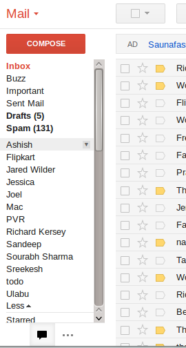
The control box is sticky at “where it is”
Now the control box is sticky at its own place. In previous version it scrolled to the top and became sticky but it’s sticky at its native place now.

The left box messages category/label and chat boxes now expand and contract on mouse over and mouse out respectivaly. No more looking for “more” link.
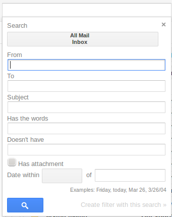
Improved and easy access to email messages search
“Show search options” and “Create a filter” links are replaced with a compact search box. The whole new search box pops up on clicking a down arrow button placed at the right end of the basic search field. This box has all basic fields to enter in case you wanted to skip entering “From: “, “To: ” manually.
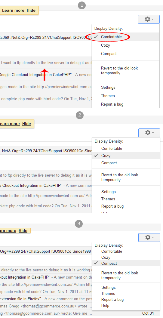
Gmail interface density spacing
In new interface you can adjust spacing/padding by switching among three available options i.e. “Comfortable”, “Cozy” and “Compact”. See the image below which displays examples of all three options.
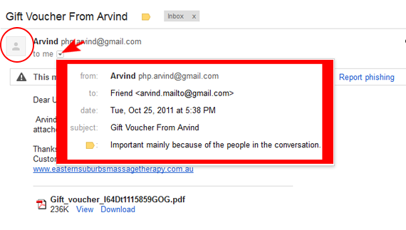
More useful message headers now
Email Message headers are presented in a more elegant way now as shown below. Also notice the user avatar there.
All messages with a preview in a conversation
When you open a new email conversation first time it is opened as showing the last message in full view mode, showing first (oldest) and second last message in preview (excerpt) mode and all other messages with a label, something like “34 older messages”. When you click this label all messages in conversation are shown in preview mode displaying an excerpt from each message. Also each message contains user avatar at the top left.

Bigger and on demand control buttons
See the difference in two images below. You will see control button box changed at the top
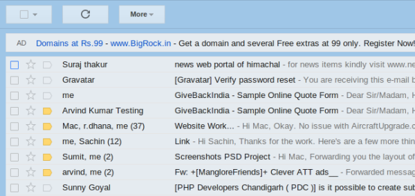
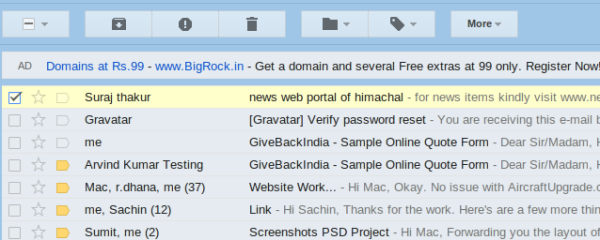
That’s it what i had summed up until i had to abandon this post. There must be some other features which i might have missed in this post. Please feel free to post them as a comment.
