React final form is one of the most popular form libraries in ReactJS. It provides different ways to implement different types of fields, some of which are, text input, textarea, radio and select input fields.
The most common way is to use components including third party components. You create custom input or select component and wrap them with <Field /> component provided by React Final Form and it does the rest for you.
Having said that, it is always not that simple however. Particularly, if you want to automatically validate different types of fields and show error messages beneath a field using {meta.error} property, which does not work for some fields when I wrote this post, this post can be helpful.
So, In this post I am going to show an example of implementing select dropdown list in React Final form without any select or input components, with simple <select><options></select> approach.
You can use fancy select input components provided by React libraries such as reactstrap or react-select if your environment allowed. But if you want to keep it simple and do not want to use any third party component, you can achieve desired results with minimum lines of code.
The example which I have used to implement my custom select options list while keeping the "value" chain and validations working as normal.
Before diving into the example let’s start with an example of using react-select to create a fancy dropdown box. The code below may not be complete and working and may require additional react steps to make it working.. It is just for general understanding of the process.
...
import renderSelectField from '@/shared/components/form/Select'
....
const MyForm = () => {

    const onSubmit = (values) => {
        //do domething
    };

    return(
        <Form
            onSubmit={onSubmit}
            validate={validate}
        >
            {({ handleSubmit, form, submitting, pristine, values }) => (
            <form onSubmit={handleSubmit}>
                <Row>
                    <Col md="4">
                        <Label>Color</Label>
                    </Col>
                    <Col md="8">
                        <Field
                                name="color"
                                className="react-select"
                                options={colorOptions}
                                placeholder={'Select Color'}
                                component={renderSelectField}
                        />
                    </Col>
                </Row>
                <div className='d-flex justify-content-end'>
                    <Button disabled={loading} color='danger' type='submit'>{'Save'}</Button>
                </div>
            </form>
            )}
        </Form>
    )
}

const validate = values => {
    let errors = {}
    if( !values.color )   {
        errors.color = 'Please select color'
    }
    return errors
}

export default MyForm;
where Select.jsx is:
import React from 'react';
import Select from 'react-select';
import PropTypes from 'prop-types';
import { renderComponentField } from '@/shared/components/form/FormField';

export const SelectField = React.forwardRef(({
  onChange, value, name, placeholder, options,
}, ref) => {
  const handleChange = (selectedOption) => {
    onChange(selectedOption);
  };

  return (
    <Select
      name={name}
      value={value}
      onChange={handleChange}
      options={options}
      clearable={false}
      className="react-select"
      placeholder={placeholder}
      classNamePrefix="react-select"
      ref={ref}
    />
  );
});

SelectField.propTypes = {
  onChange: PropTypes.func.isRequired,
  name: PropTypes.string.isRequired,
  placeholder: PropTypes.string,
  options: PropTypes.arrayOf(PropTypes.shape({
    value: PropTypes.string,
    label: PropTypes.string,
  })),
  value: PropTypes.oneOfType([
    PropTypes.string,
    PropTypes.shape({
      value: PropTypes.string,
      label: PropTypes.string,
    }),
  ]).isRequired,
};

SelectField.defaultProps = {
  placeholder: '',
  options: [],
};

export default renderComponentField(SelectField);
And FormField.jsx
import React from 'react';
import classNames from 'classnames';
import PropTypes from 'prop-types';
import Error from '@/shared/components/form/Error';

const FormField = ({
  input, meta: { touched, error }, component: Component, isAboveError, wrapperClassName, ...props
}) => (
  <div className={classNames(
    'form__form-group-input-wrap',
    { 'form__form-group-input-wrap--error-above': isAboveError },
    wrapperClassName,
    )}
  >
    <Component {...props} {...input} />
    {touched && error && <Error error={error} />}
  </div>
);

FormField.propTypes = {
  input: PropTypes.shape(),
  meta: PropTypes.shape({
    touched: PropTypes.bool,
    error: PropTypes.string,
  }),
  component: PropTypes.elementType,
  isAboveError: PropTypes.bool,
  wrapperClassName: PropTypes.string,
};

FormField.defaultProps = {
  input: null,
  meta: {
    touched: false,
    error: '',
  },
  component: 'input',
  isAboveError: false,
  wrapperClassName: '',
};

export const renderComponentField = component => props => (<FormField component={component} {...props} />);

export default FormField;
Using the approach above one would see a beautiful looking dropdown
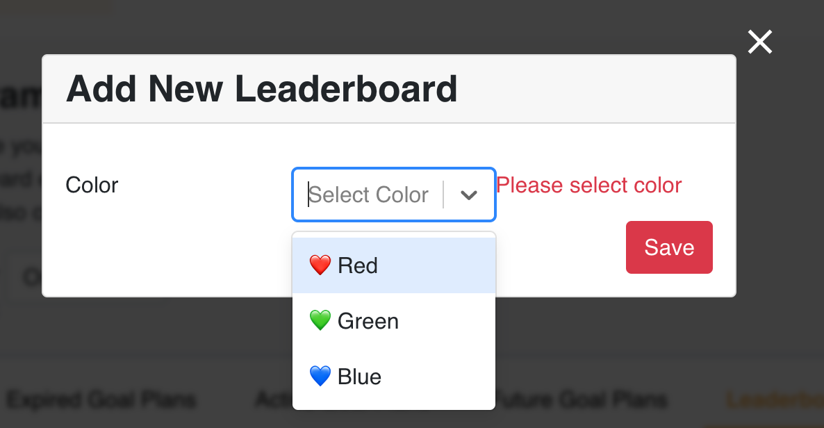
Minimal Approach
Now lets see the simple implementation with help of mutators provided by React-final-form
const MyForm = () => {
const handleChange = ([field], state) => {
const tfield = state.fields["color"];
tfield.change(field.target.value)
}
const onSubmit = (values) => {
//do domething
};
return(
<Form
onSubmit={onSubmit}
validate={validate}
mutators={{
handleChange
}}
>
{({ handleSubmit, form, submitting, pristine, values }) => (
<form onSubmit={handleSubmit}>
<Row>
<Col md="4">
<Label>Color</Label>
</Col>
<Col md="8">
<Field name="color">
{({ input, meta }) => (
<>
<select onChange={form.mutators.handleChange}>
<option value="">-- select --</option>
<option value="#ff0000">❤️ Red</option>
<option value="#00ff00">💚 Green</option>
<option value="#0000ff">💙 Blue</option>
</select>
{meta.touched && meta.error && <span className="text-danger">
{meta.error}
</span>}
</>
)}
</Field>
</Col>
</Row>
<div className='d-flex justify-content-end'>
<Button disabled={loading} color='danger' type='submit'>{'Save'}</Button>
</div>
</form>
)}
</Form>
)
}
const validate = values => {
let errors = {}
if( !values.name ) {
errors.name = 'Please enter leaderboard name'
}
if( !values.color ) {
errors.color = 'Please select color'
}
return errors
}
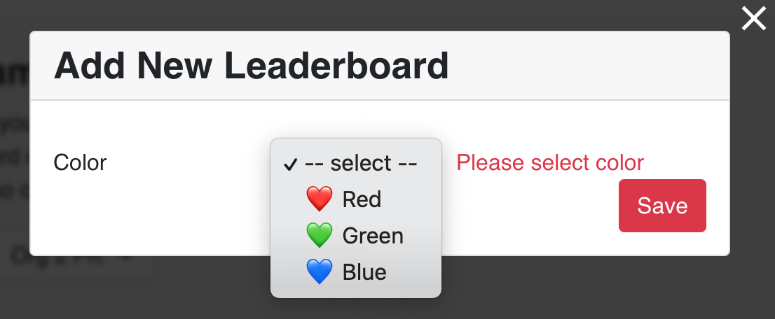
export default MyForm;You see how it looks!
What did we do?
In the <Form> component it binds our custom method handleChange as a mutator(as shown below)
<Form onSubmit={onSubmit} validate={validate} mutators={{ handleChange }} >And then we call it in the <select> input field as onChange event (as shown below)
<select onChange={form.mutators.handleChange}>Rest of things are same and it works just as normal as it should.
What is the difference?
Although the first approach, that is, working with react-select looks awesome, sometimes you may want to get just the simple dropdown working without needing any fancy stuff, so in that case second one can be handy.
Please let me know your thoughts on my post on react-final-form custom select options dropdown with validation.