Flexbox is a new and revolutionary way to manage blocks. Conventionally, blocks are managed via defining display: block for vertical blocks and display: inline or display: inline-block for horizontally placing blocks. By block, we mean by element here.
Flexbox provides us an efficient way to control how the elements are sized, aligned (vertically or horizontally), change their order of appearance, change the direction in which all elements are laid out within the container.
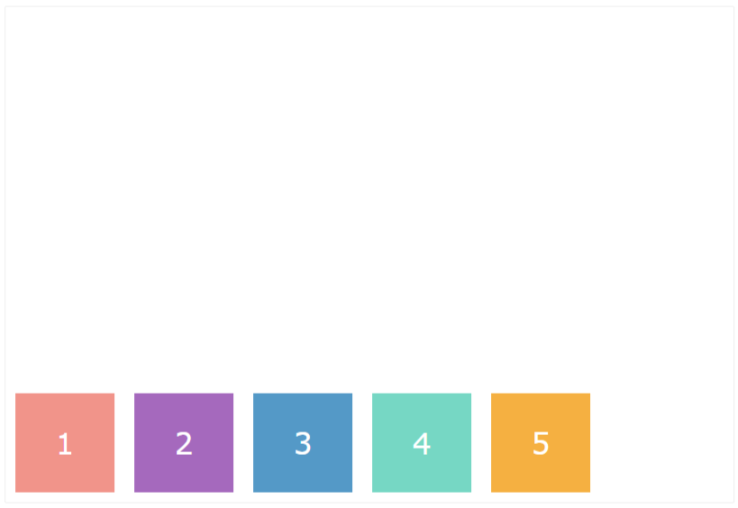
The Flex structure layout is based on dividing elements into containers (parent elements) and items (child elements).
.flex-container {
  display: flex;
  border: 1px solid #eee;
  border-radius: 2px;
}

.flex-item {
  width: 100px;
  margin: 10px;
  text-align: center;
  line-height: 100px;
  font-size: 30px;
  color: white;
}
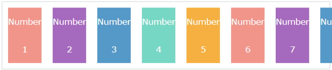
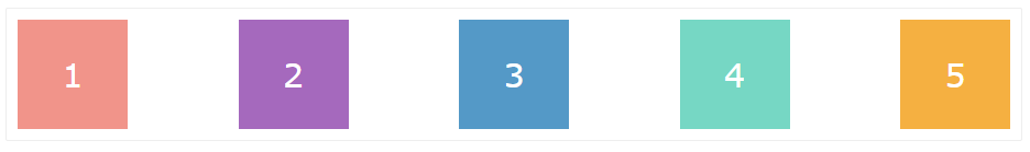
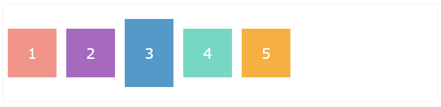
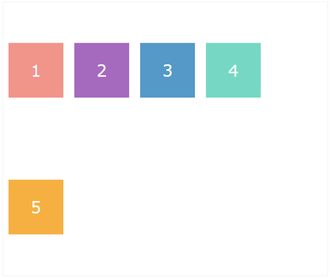
<div class="flex-container">
    <div style=”background-color:#F1948A;” class="flex-item">1</div>
    <div style=”background-color:#A569BD;” class="flex-item">2</div>
    <div style=”background-color:#5499C7;” class="flex-item”>3</div>
    <div style=”background-color:#76D7C4;” class="flex-item”>4</div>
    <div style=”background-color:#F5B041;” class="flex-item">5</div>
</div>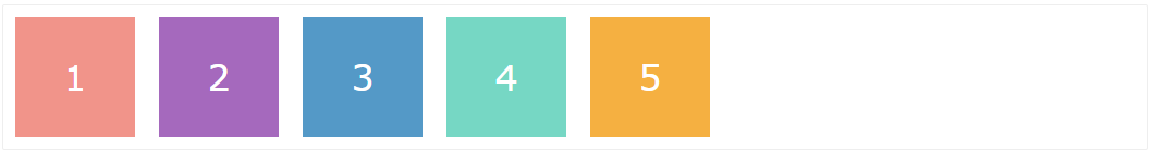
Note: By default, items are aligned in Row from Left to Right.
Flex-direction
The flex-direction property changes the position and direction of the items. It has four possible values:
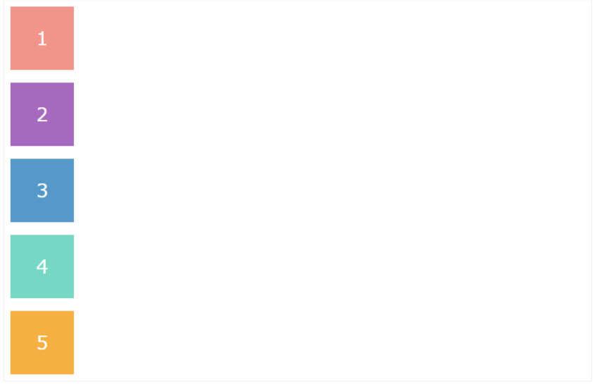
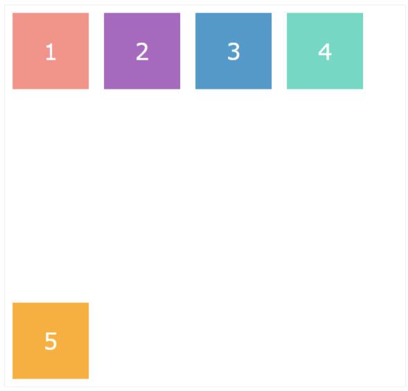
flex-direction: column – the direction of items is from top to bottom.
.flex-container {
      display: flex;
      flex-direction: column;
   }
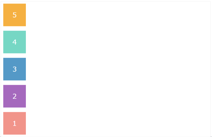
flex-direction: column-reverse – the direction of items is from bottom to top.
.flex-container {
      display: flex;
      flex-direction: column-reverse;
   }
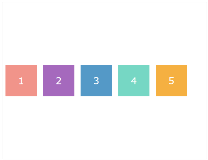
flex-direction: row (default) – the direction of flex items is from left to right.
.flex-container {
      display: flex;
      flex-direction: row;
    }
flex-direction: row-reverse – the direction of flex items is from right to left.
.flex-container {
      display: flex;
      flex-direction: row-reverse;
    }
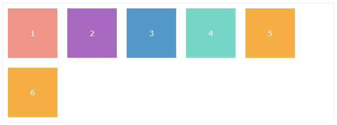
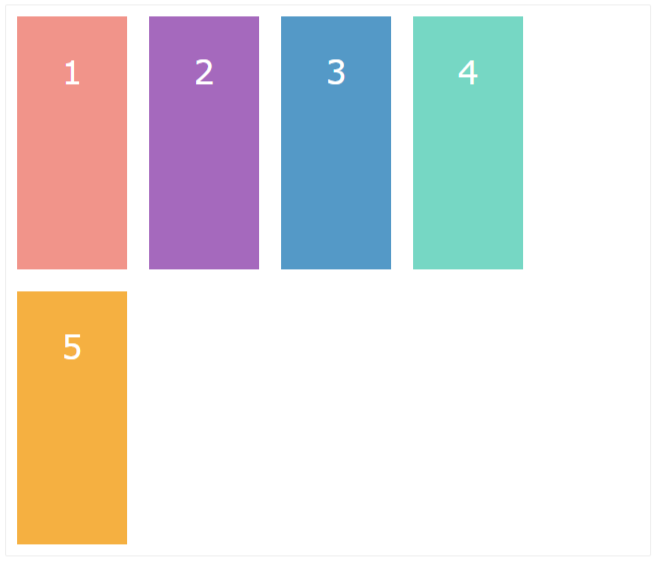
Flex-wrap
The flex-wrap property defines how the items inside the containers should wrap when it has too many items. The possible flex-wrap values are nowrap, wrap, and wrap-reverse.
flex-wrap: wrap – allows items to wrap inside the container.
.flex-container {
      display: flex;
      flex-wrap: wrap;
   }
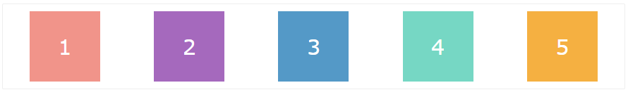
flex-wrap: nowrap (default) – the items don’t wrap inside the containers. Instead, they overflow the container.
.flex-container {
      display: flex;
      flex-wrap: nowrap;
   }
flex-wrap: wrap-reverse – the items wrap in the reverse direction, from bottom to top.
.flex-container {
      display: flex;
      flex-wrap: wrap-reverse;
   }
Flex-flow
We can specify flex-direction and flex-wrap in one declaration through the flex-flow property. The default value of flex-flow is the combination of default values of the two properties. i.e.:
flex-flow: row nowrap;
.flex-container {
      display: flex;
      flex-flow: row wrap;
    }
Justify-content
This Flex property determines how space is allotted between items inside the container.
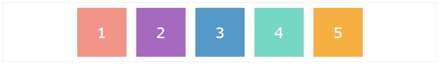
justify-content: flex-start (default) – aligns items against the start of the flex container.
.flex-container {
      display: flex;
      justify-content: flex-start;
    }
justify-content: flex-end – aligns items against the end of the flex container.
.flex-container {
      display: flex;
      justify-content: flex-end;
   }
justify-content: center – aligns the flex items to the center of the flex container.
.flex-container {
      display: flex;
      justify-content: center;
   }
 justify-content: space-between – puts an even amount of space between flex items, but does not add space on the ends. The first item sticks to the start of the line. The last item sticks to the end of the line.
.flex-container {
      display: flex;
      justify-content: space-between;
   }
justify-content: space-around – distributes items evenly, with equal spaces around each of them.
.flex-container {
      display: flex;
      justify-content: space-around;
   }
Align-items
We can align the items inside the container using the align-items property. This property aligns the elements along the vertical axis.
Let us consider align-items property as a vertical version of justify-content. While justify-content goes on the x-axis the align-items go on the y-axis.
align-items: flex-start – aligns the items towards the top of the flex container.
.flex-container {
      display: flex;
      align-items: flex-start;
   }
align-items: flex-end – aligns the items at the bottom of the flex container.
.flex-container {
      display: flex;
      align-items: flex-end;
   }
align-items: center – places items in the middle of the flex container.
.flex-container {
      display: flex;
      align-items: center;
   }
align-items: stretch (default) – each item will fill the space from top to bottom if minimum or definite height is not set.
flex-container {
      display: flex;
      align-items: stretch;
   }
align-items: baseline – aligns items along their baseline of content (the line upon which most letters sit). Baseline depends on the tallest item in a line.
.flex-container {
      display: flex;
      align-items: baseline;
   }
Align-content
The align-content property is similar to align-items, but it aligns lines of items within a container vertically.
Note: If there is only one line of items in a container, this property won’t work.
align-content: flex-start – distributes lines towards the start of the container.
.flex-container {
      display: flex;
      align-content: flex-start;
      flex-wrap: wrap;
   }
align-content: flex-end – distributes lines towards the end of the container.
.flex-container {
      display: flex;
      align-content: flex-end;
      flex-wrap: wrap;
   }
align-content: center – distributes lines at the center of the container.
.flex-container {
      display: flex;
      align-content: center;
      flex-wrap: wrap;
   }
align-content: stretch (default) – stretches the lines to use all available space of the container.
flex-container {
      display: flex;
      align-content: stretch;
      flex-wrap: wrap;
  }
align-content: space-between – distribute lines in a flex container such that there is an equal amount of space between each line.
.flex-container {
      display: flex;
      align-content: space-between;
      flex-wrap: wrap;
   }
align-content: space-around – distribute lines in a flex container such that there is an equal amount of space around each line.
.flex-container {
      display: flex;
      align-content: space-around;
      flex-wrap: wrap;
   }
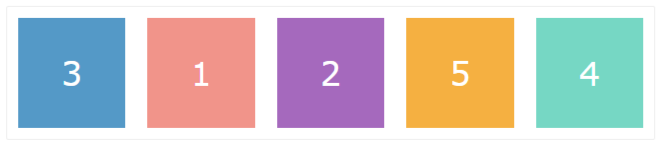
Order
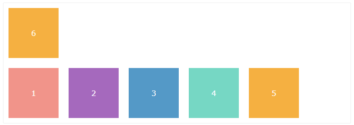
By default, flex items in the container appear in the same order in which they are coded. But we can change this sequence using the order property.
We can assign a negative or positive number as its value. According to these numbers, the items will be re-ordered. The lowest numbers go first and the highest numbers go last.
<div class="flex-container">
    <div class="flex-item" style="order: 2">1</div>
    <div class="flex-item" style="order: 3">2</div>
    <div class="flex-item" style="order: 1">3</div>
    <div class="flex-item" style="order: 5">4</div>
    <div class="flex-item" style="order: 4">5</div>
</div>
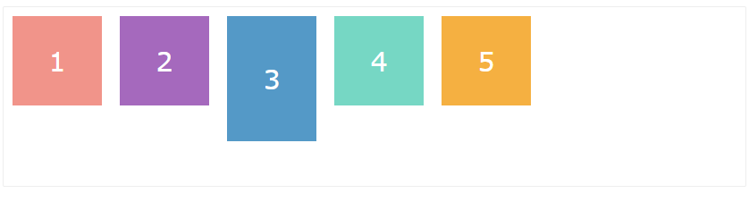
Flex-grow
The flex-grow property defines how much a flex item expands with respect to other items (if space available). We set its value using positive numbers. The number represents a proportion.
For example, if we assign flex-grow: 2 to a flex item, it will expand twice as big compared to the rest of the items in the same flex container.
<div class="flex-container">
    <div class="flex-item" style="flex-grow: 4">1</div>
    <div class="flex-item" style="flex-grow: 1">2</div>
    <div class="flex-item" style="flex-grow: 1">3</div>
    <div class="flex-item" style="flex-grow: 1">4</div>
    <div class="flex-item" style="flex-grow: 1">5</div>
</div>

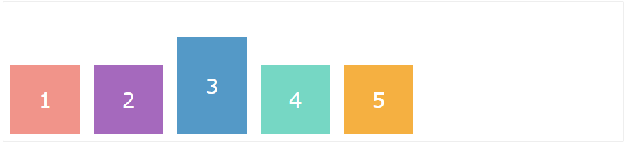
Flex-shrink
The flex-shrink property defines the proportion in which a flex item shrinks more than other items in that container (when there is not enough space to keep the original size).
<div class="flex-container">
    <div class="flex-item box-1" style="flex-shrink: 3">1</div>
    <div class="flex-item box-2">2</div>
    <div class="flex-item box-3" style="flex-shrink: 2">3</div>
    <div class="flex-item box-4">4</div>
    <div class="flex-item box-5">5</div>
</div>

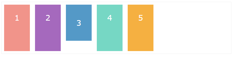
Align-self
The align-self property overrides the values of align-items to align a single item.
In the following example, item #2 has the align-self: flex-start property, #3 has the align-self: center property and item #4 has the align-self: flex-end property rest items have default property.
<div class="flex-container">
     <div class="flex-item box-1">1</div>
     <div class="flex-item box-2" style="align-self: flex-start">2</div>
     <div class="flex-item box-3" style="align-self: center">3</div>
     <div class="flex-item box-4" style="align-self: flex-end">4</div>
     <div class="flex-item box-5">5</div>
</div>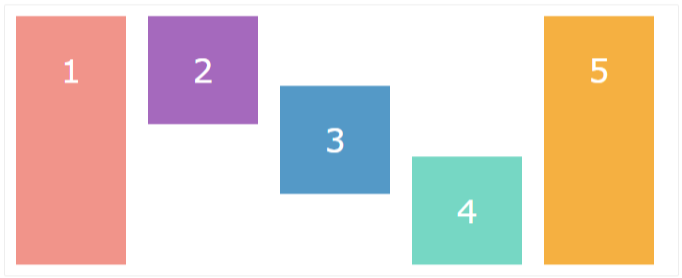